ICICI Prudential x Perky Owl Designs: Turning Fine Print Into Clear Communication
- Suriti Arora

- Jul 28, 2025
- 2 min read

If there’s one thing most people agree on about life insurance... it’s that nobody wants to read about life insurance.
It’s complex. It’s cluttered. And most brand communication in this space? Feels like it was written by and for actuaries.
Enter Perky Owl Designs.
When ICICI Prudential Life came to us, their brief was simple but ambitious:
Make our communication human. Clean. Clutter-free. And honestly... not devoid of emotion. It should help educate the audience about why insurance is important.
Challenge accepted.
The Problem: Insurance Talk = Information Overload
Visual identity felt heavy, technical, and transactional
Text-heavy layouts with poor hierarchy; key info got lost
Too much reliance on small fonts, footnotes, disclaimers, and wall-of-text styles
A confusing experience for everyone from first-time customers to financial advisors
Simply put: the communication wasn’t helping. It was... hurting.
The Perky Owl Fix: Simplicity Is the New Premium
We overhauled their entire communication system with one mission:
make it feel like a conversation, not a contract.
>Clean, breathable layouts: no more visual suffocation
>Stronger visual hierarchy: key messages pop, small print stays where it belongs
>Simplified iconography and design language: because clarity looks like something
>A tone that’s helpful, not preachy. Friendly, not fluffy.
>A system that works across formats: from brochures to WhatsApp creatives, from ad banners to internal decks
This wasn’t just design. This was building communication that respected people’s attention.
What It Looked Like:
Brochures that didn’t feel like homework
WhatsApp posts that delivered info without the chaos
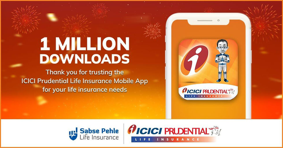
Digital banners that told you exactly what you needed without the fine print yelling louder than the headline
Internal communication templates that advisors actually wanted to use (and didn’t secretly hate)
Everything was designed to feel sharp, simple, and scalable.
Why It Worked
When you remove clutter, what’s left is clarity.
ICICI Prudential’s revamped design language looked and communicated better. It helped:
Build trust (because clarity always does)
Improve message recall (less noise, more focus)
Reduce confusion for customers (and stress for advisors)

Whether it was a website banner, an explainer deck, or a social media post, every single asset was now rooted in simplicity and customer-first design.
What Perky Owl Designs Brings (Again and Again)
At Perky Owl Designs, a leading design agency in Delhi, we believe complexity isn’t a badge of honor. Clarity wins. Simplicity converts. Design isn’t just decoration, it’s how your brand speaks.
Whether you're in financial services, insurance, or any industry where trust is currency, we offer more than just aesthetics. From branding services to UI/UX design and communication design, we turn fine print into clear, compelling information.
Let’s redesign how you talk to your customers, one clean layout at a time.


Comments