
Beyond the Surface: How Perky Owl Enabled Vedanta Aluminium To Cut Through the Noise
- Suriti Arora

- Aug 22, 2025
- 2 min read
In industries like aluminium manufacturing, everyone talks numbers. Output. Efficiency. Scale.
But when Vedanta Aluminium asked us to revamp how they looked on paper, in booths, and across presentations, they weren’t looking to repeat what was already being said.
They were looking for resonance; design that simplified without oversimplifying, and showed just how much thought, impact, and innovation sat behind their operations.
Here’s how we made that happen.
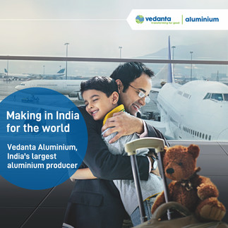
First, the Brochures Had to Work Harder
Aluminium may be rigid, but communication shouldn’t be.
We created a set of brochures that weren’t just “nice to have” collateral, they were conversation tools. Crafted to:
Streamline dense information into structured layouts
Make sustainability initiatives understandable (and credible)
Reflect the scale and seriousness of Vedanta’s industrial leadership


These pieces didn’t just sit on desks. They enabled Vedanta to show up stronger at every table from global events to stakeholder meetings.
Then Came the Event Assets: Strategic, Not Just Scenic
We’ve all seen event graphics that look good but say nothing.
This wasn’t that.
Each poster, wall panel, and display we designed had a job to do. Whether it was to explain complex processes or invite someone to start a conversation, the visual system was:
Minimal yet bold
Metallic but never cold
Educational without being overwhelming


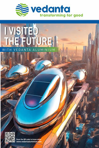
Clean grids, sharp typography, and subtle material cues ensured the design felt as advanced as the aluminium technology it represented.
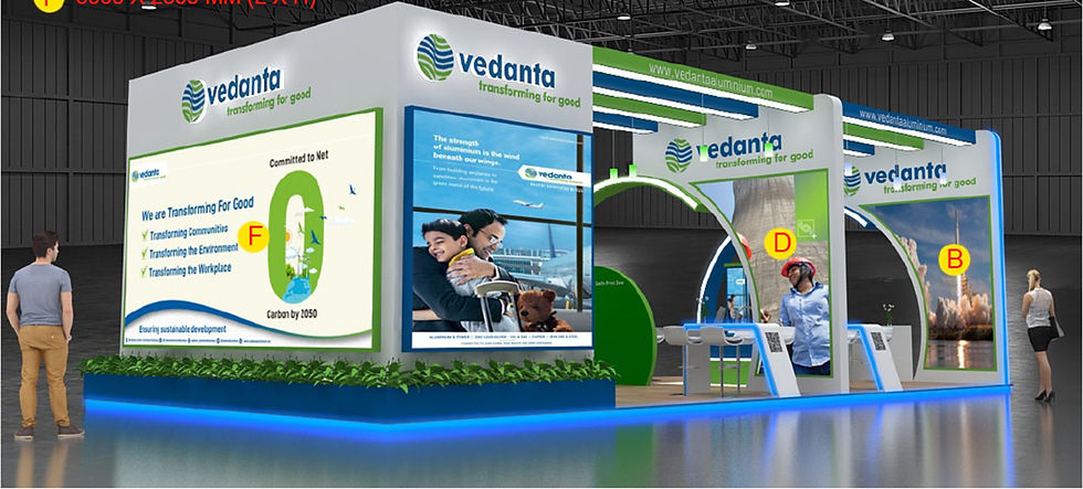
Turning Booths Into Brand Architecture
An event stall is more than a backdrop. It’s a compressed expression of everything the brand stands for.
So, we designed Vedanta’s stalls like we were building an ecosystem.
With clearly marked zones: one for innovation, one for sustainability, and one just for sheer visual presence, the space invited people to explore, understand, and engage. All held together with one design language that felt confident and cohesive across formats.
The Result? Communication with Muscle (and Finesse)
This wasn’t about flashy design. It was about designing for:
Better recall, without resorting to overused tropes
A clearer story, minus the corporate clutter
A brand presence that felt modern, trustworthy, and future-ready


From booth to brochure, the Vedanta brand now had a unified voice that could speak fluently to investors, partners, media, and policymakers alike.
Why This Work Matters to Us
At Perky Owl Designs, we’ve always believed that industries like aluminium, energy, and infrastructure deserve better than template decks and uninspired signage.
We design for industries where the work is serious and the design needs to earn its place.
That means:
Taking jargon-heavy material and making it digestible
Creating visual identities that mirror operational excellence
Helping brands communicate not just what they do, but why it matters
If you’re building the future, we’ll make sure your design reflects that.
Let’s turn your technical edge into storytelling that sticks.


Comments